Most Stunning Greige Paint Colors – Our Favorite Shades
If you’ve ever stood in the paint aisle staring a billion nearly identical “gray-ish beige-ish” swatches… same.
I was recently looking for the perfect greige shade for the playroom of our house, and man… it can get confusing out there trying to pick a greige!
Greige is one of those colors that looks simple but can go very very wrong if you don’t pick the right undertone.
The reason everyone loves greige, though? It’s the perfect in between. Not too cold, not too warm, and it works with pretty much every style.
It’s also one of the safest ways to make your home feel updated without going full-on gray (which can feel a little cold) or beige (which can feel dated if you’re not careful).
So, if you’re on the hunt for the perfect Greige, here were the top contenders when I was picking a greige for myself!
Scared You’re Going to Pick the Wrong Greige?
Even after reading this entire article, you may have a couple ideas of your favorites, but still feel uneasy about committing.
Do not forget that your home is going to be totally different from anyone else’s.
Your lighting, your floors, your furniture… it all changes how a color shows up.
That’s why sampling isn’t optional. It is a must!!
This is exactly why I always recommend Samplize. (my dearest love as a paint color enthusiast!)
Samplize sends you large, peel-and-stick paint samples made with real paint (not printed color).
You can move them around your space, see how the color looks in different lighting throughout the day, and compare a few options side by side without the commitment.
It just makes the whole process so much easier. It’ll save you from the regret of painting an entire room the wrong shade.
They have an entire tab of “greige” colors (so many more than I’ll even talk about here) so you can pick the ones you’re considering, and give them a good test at home for a really low fee. Trust me, IT’LL BE WORTH IT!!
Best Greige Paint Colors
Alright, without further ado, here are the best greige paint colors!
Sherwin Williams Repose Gray
Repose Gray is one of the most popular greige paint colors. Of course, it was one of the first ones I looked into as well.
It sits right in that soft gray greige zone with an LRV of 58, so it reflects a decent amount of light without feeling stark or washed out.
This one leans a little cooler compared to some of the other greiges on this list.
It pairs really well with gold hardware and crisp white trim.
In bright, south facing rooms, it looks super balanced. It’s almost like the perfect “designer gray” in these situations.
But in north-facing spaces or lower light, it can pull slightly lavender or purple, which surprises people if they haven’t tested it first.
I love seeing Repose Gray being used on cabinets, in bedrooms, living rooms, or anywhere you want a more modern, relaxed feel.
If your home leans more contemporary, this is such a solid choice.
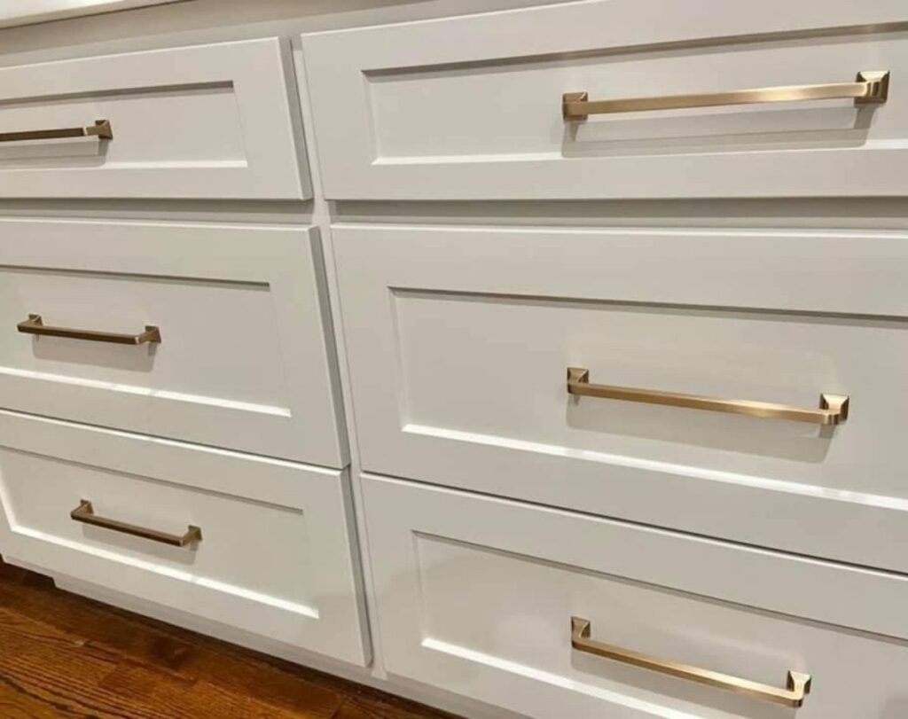
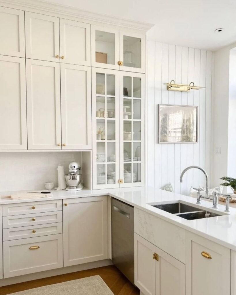
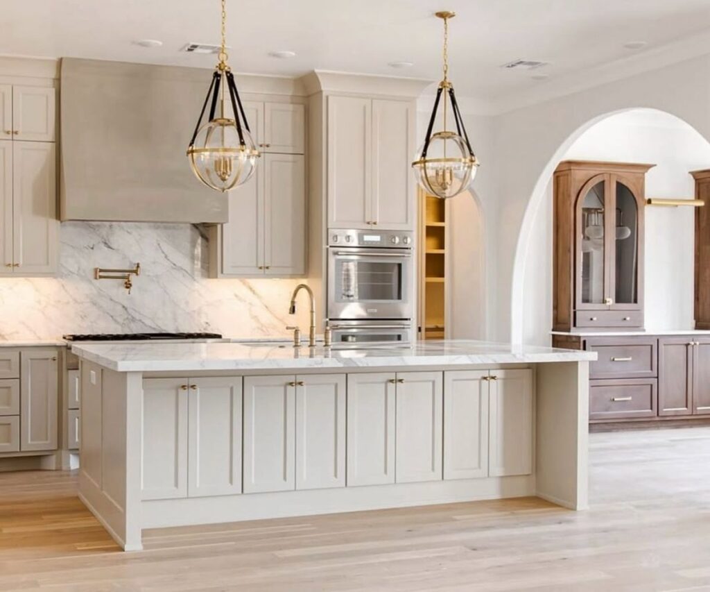
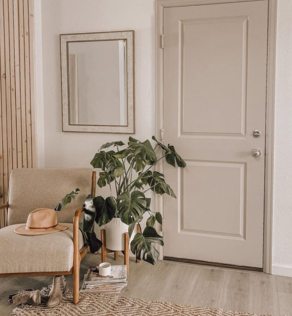
Benjamin Moore Balboa Mist
Balboa Mist is a light greige but in darker settings, I can really appear much darker than it’s advertised!
It’s technically a warm gray, but it can lean slightly violet in certain lighting (especially cooler light), so this is another one where sampling is key.
This one is especially great if you want something subtle and neutral that still has a little personality. Think of it as the “safe but elevated” option.
Like on these cabinets for instance, it really appears darker than I think it looks on walls. My guess?
The angle of the camera is just not picking up as much natural sunlight. That’s why I always say TEST TEST TEST paint colors!
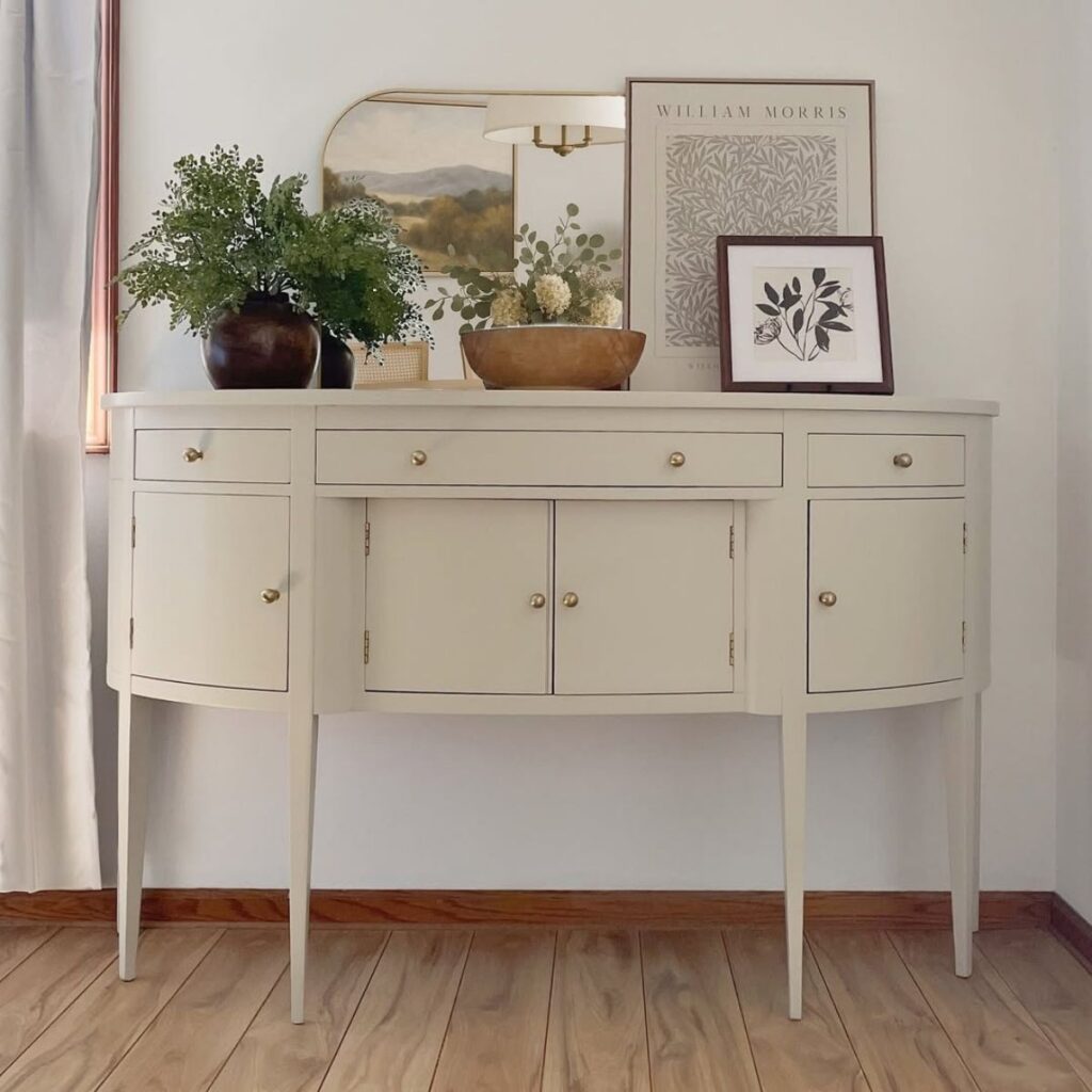
Benjamin Moore Natural Cream
Ah My PERSONAL FAVORITE? Heart eyes!!! I just love Natural Cream by Benjamin Moore and yet it’s one of the least popular greige paint colors!
Natural Cream is definitely on the warmer side of greige, almost more beige than gray, but in the BEST way.
This color shines in spaces where you want that cozy, welcoming feel.
It works really well with wood tones, warmer finishes, and traditional or transitional styles.
In bright light, it reads soft and creamy, like you see below.
I’d use this in living rooms, bedrooms, or anywhere you want a softer, more classic look.
It’s also a great alternative if you feel like gray tones are just a little too cool for your taste.
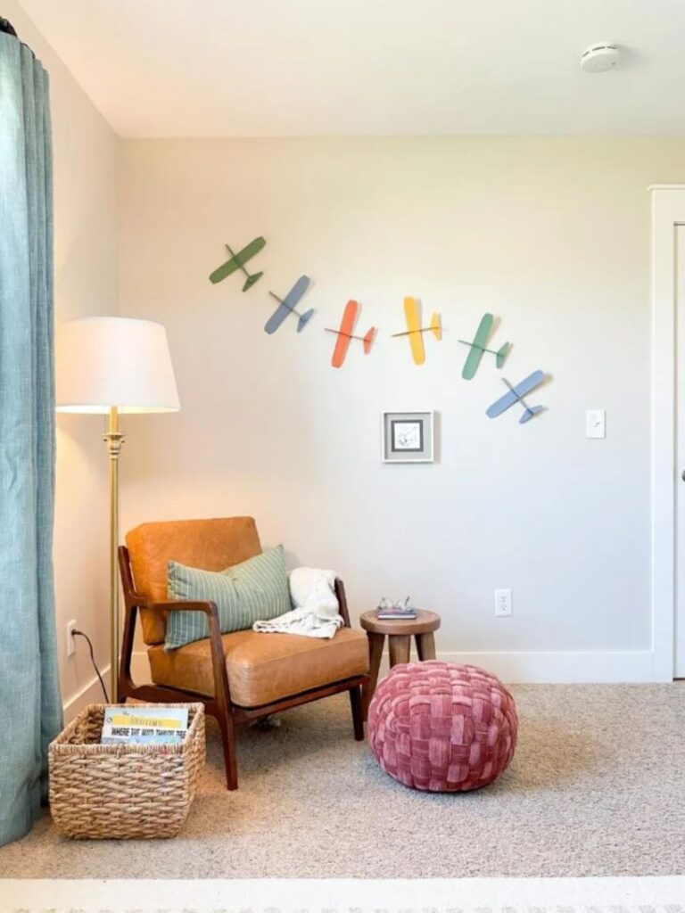
Sherwin Williams Agreeable Gray
Agreeable Gray is THE greige. Like, the color that started the greige frenzy to start with.
I mean, I feel like between 2023-2025 EVERYONE and their mama was using Agreeable Gray.
I guess like all things, the hype had to slowly die. Now people are venturing to other greige colors (but probably just for the sake of being different, because Agreeable Gray is still a stunner).
If you’ve been searching for even five minutes, you’ve probably seen it, but honestly it does deserve a look.
With an LRV of 60, it hits that sweet spot of not too light, not too dark.
This is my go-to for a whole house paint color because it just adapts. (so if you’re looking for a greige for an entire house, this is probably still the one I’d recommend).
It reads neutral in most spaces. It’s one of the most versatile colors out there.
The only thing to watch for is a slight green undertone that can pop up depending on your surroundings, but it’s usually very subtle.
Sherwin Williams Accessible Beige
Accessible Beige is another warm leaning greige, but it has a bit more depth and richness compared to something like Agreeable Gray (the color we just talked about!)
Its LRV is around 58, so it’s still light, just slightly more grounded.
It leans beige with a soft gray base, which makes it feel warm without going yellow.
In natural light, it looks beautifully balanced. In lower light, it can read a little deeper and cozier.
This is such a great option for both interiors and exteriors.
Sherwin Williams Alabaster
Okay, Alabaster technically leans more white, but it lives right on the edge of greige, so it deserves a spot here.
(mainly just including it because it’s a personal favorite paint color in general and any chance I get to hype it up – I take!)
With a high LRV of 82, it reflects a ton of light and makes spaces feel bright and open.
What keeps it from feeling stark is its soft, warm undertone. It’s not a cold white at all. Instead, it has that creamy, slightly beige base.
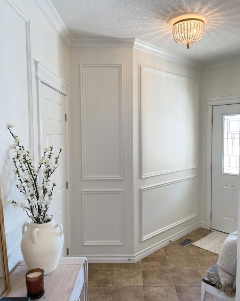
This is perfect if you want a light, neutral backdrop without it feeling “hospital vibes”.
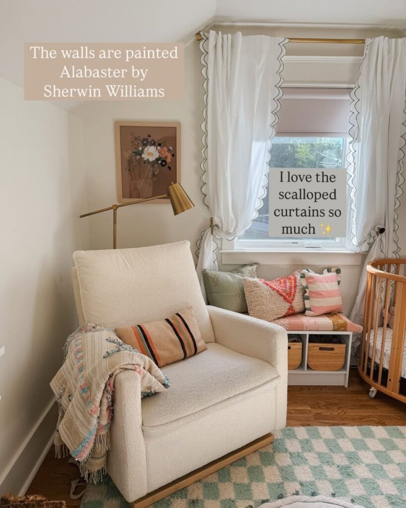
Just keep in mind that in very bright light, it can look more white, and in dimmer spaces, you’ll see more of that warm undertone come through.
Benjamin Moore Edgecomb Gray
Edgecomb Gray is one of those classic colors that just always looks good. People have been using it for years and will keep on using it for years.
It has an LRV around 63, so it’s light and airy, similar to Agreeable Gray but just a touch softer.
This is a great whole-home color as well!
If you’re still feeling overwhelmed by options, this is one of those “you really can’t mess this up” shades.
Sherwin Williams Anew Gray
Anew Gray is like Agreeable Gray’s moodier, slightly more dramatic sister. Or Cousin..;)
With an LRV of 47, it’s noticeably darker, which gives it a richer, more grounded feel.
It can even pick up a slight purple or brown tone depending on lighting.
It can get a bit heavy, so balance it with lighter furniture and decor.
This is a great option if you want a little more depth without going full dark.
I love it on interior doors, accent walls and even redone furniture!
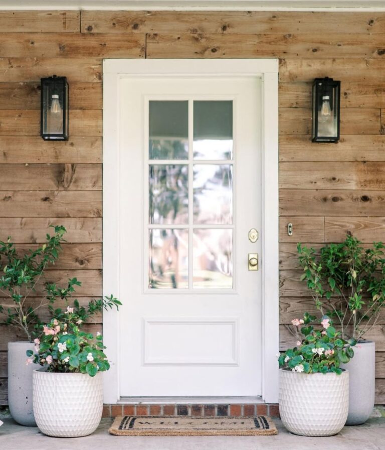
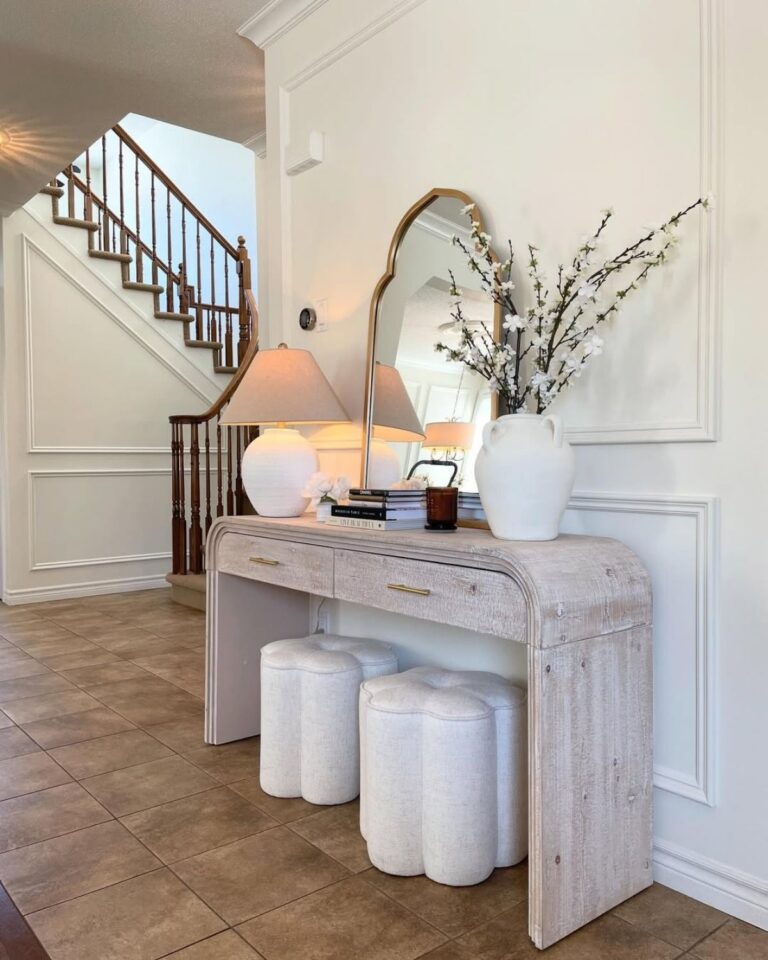
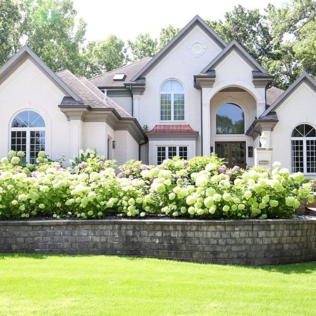
Benjamin Moore Revere Pewter
Revere Pewter is a classic for a reason. It’s been a designer favorite forever, and it still holds up.
With an LRV around 55, it sits right in the middle. It leans warm and has a bit more depth than some of the lighter greiges.
It does have some complex undertones (a mix of gray, beige, and a hint of green), so it can shift depending on lighting.
But when it works, it really works. (like in this bathroom!)
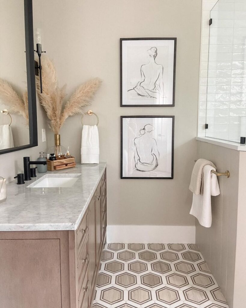
It’s especially beautiful in traditional or transitional homes, and in spaces where you want a little more warmth and character.
Looking for exterior paint colors? This is another stunner! Do note how different it looks from the interior bathroom picture above and the exterior home picture below.
Lighting really does change paint colors!
Conclusion
Here’s the honest truth, there’s no such thing as a “perfect” greige that works everywhere.
Lighting changes everything, and the same color can look completely different from one room to the next.
That’s why sampling is non-negotiable. Paint a few swatches, look at them throughout the day, and trust what you see in your space, not just what looks good online.
But once you land on the right one? Greige is kind of magic.
It makes your home feel calm, cohesive, and effortlessly put together without trying too hard and honestly, that’s exactly what most of us are going for.